|
|
 
|
|
Author
|
Topic: BEAUTY AND THE BEAST
|
Frank Angel
Film God

Posts: 5305
From: Brooklyn NY USA
Registered: Dec 1999
|
 posted 08-04-2017 11:21 AM


Watched this on an LG OLED 3D with an LG BluRay player - passive RealD 3D circular polarization glasses. This system has always given me excellent visuals in both 2D and 3D with better blacks than in any commercial theatre and certainly better 3D than any of the RealD (RealDim) 3D commercial houses in Brooklyn. Even IMAX, which is my go-to place to see any 3D film when I feel the need to go to a commercial cinema to sit among the texting, chattering, great unwashed, doesn't give as good blacks as my home setup. That said, there was something going on with this BR that is wrong and that I had never seen before on this system - in other words, I am pretty convinced it's not the system.
I have yet to look at the 2D disc to see it is particular to the 3D version and then I need to play it on the JVC D-ILIA projector system to see if it happens when projected, but for now all I can report is that the 3D BluRay looks like it has a bug. The image is fine as along as there is no horizontal movement. As soon as the camera pans, everything has this disconcerting strobe effect and it's subtle, but it is there and in 3D it made me crazy. It didn't seem to bother my friends, but they did see what I was complaining about. This definitely looks like a problem with the way the disc was authored or something with the original film, but whatever, to me it look like a fault. If anyone else has the 3D BluRay, I would like to know if you see what I am talking about.
As for the film itself, let me preface this by saying I didn't get to see this commercially in IMAX (my go-to cinema if I want to see a 3D movie -- I simply won't go to a RealDim 3D cinema anywhere in my area because their 3D presentation is so below par) so the BluRay is my first viewing of the film and while aside from the strange anomaly mentioned above, I found it watchable, but my overall impression was, "Why bother with this unnecessary remake?" I was under-impressed....big time. It was practically a scene-for-scene duplication of the original but with less emotional content and I didn't like it nearly as much. I ran the 1991 version for a week in 35mm and never tired of it. Just one example of why I prefer the animated version, the transformation from Beast to Handsome Man is much more dramatic in the animated version with the score ascending dramatically and great accompanying visuals. In this new version, it's much too understated for a climax. However what I will give this pluses for is that Disney visual magic in the show scenes, all those dots of swirling light that Disney artists always love to use...glistening points of swirling light I like to call them, it's almost a Disney signature look; there's plenty of that and it look spectacular in 3D.
This new live-animation hybrid lacked the charm of the animated, the feel of it was much darker and ominous due to the dark sets and lighting; too much realism than fantasy for a story-musical that is the essence of fantasy. It mostly didn't work for me.
Funny thing is, Emma Watson is just about as cartoon-ish looking as you can get with a live actress. She barely has more than one expression throughout. I did like the work they did with Beast; facial expressions were spot on...reminds me of the great work done in the current Planet of the Ape movies.
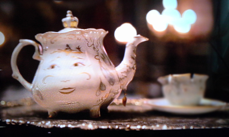
I found the animation of the inanimate objects the worst aspect of this incarnation. The candle stick holder was especially unpleasant; it certainly works better as an animated character. Emma Thompson does a good match to Angela Landsbury's great vocalization of Mrs. Potts and the teapot and cup being the best of these humanized objects, mainly because Mrs. Potts looks more like a cartoon that a real teapot. The Wardrobe chest thing didn't work at all for me -- what part are the eyes, which of all those moving parts is supposed to be the mouth when it's talking?
Then there is what I consider the bizarre choice of going shallow depth-of-field in so many shots where they pull focus and keep either foreground or background out of focus. In this film, it seems to be done randomly and for no aesthetic reason - like the director wanting the viewer to focus on an person or element that is more important that everything else in the frame. Here it seems at odds with even that rationale. In one shot of the the teapot and the cup are in exactly the same plane, one right next to the other on the table top; there's no reason at all for one to be in focus and the other not, but all of a sudden, the cup goes out of focus. Really weird. And there are many shots like this with deliberate shifts in the focal plane in mid-scene. And mind you, I understand when this is done purposely by the director, but there seems to be no rhyme or reason in many of these scenes.

Wha??
I say, if you don't have the 1991 version on BluRay 3D, get that first. That one I will give a 4/5; this one a 2.5/5 for content and a 1/5 for video quality.
| IP: Logged
|
|
|
|
|
|
|
|
|
|
|
|
|
|
|
|
All times are Central (GMT -6:00)
|
|
Powered by Infopop Corporation
UBB.classicTM
6.3.1.2
The Film-Tech Forums are designed for various members related to the cinema industry to express their opinions, viewpoints and testimonials on various products, services and events based upon speculation, personal knowledge and factual information through use, therefore all views represented here allow no liability upon the publishers of this web site and the owners of said views assume no liability for any ill will resulting from these postings. The posts made here are for educational as well as entertainment purposes and as such anyone viewing this portion of the website must accept these views as statements of the author of that opinion
and agrees to release the authors from any and all liability.
|

 Home
Home
 Products
 Store
Store
 Forum
Forum
 Warehouse
 Contact Us


 Printer-friendly view of this topic


