Welcome to the new Film-Tech Forums!
The forum you are looking at is entirely new software. Because there was no good way to import all of the old archived data from the last 20 years on the old software, everyone will need to register for a new account to participate.
To access the original forums from 1999-2019 which are now a "read only" status, click on the "FORUM ARCHIVE" link above.
Please remember registering with your first and last REAL name is mandatory. This forum is for professionals and fake names are not permitted. To get to the registration page click here.
Once the registration has been approved, you will be able to login via the link in the upper right corner of this page.
Also, please remember while it is highly encouraged to upload an avatar image to your profile, is not a requirement. If you choose to upload an avatar image, please remember that it IS a requirement that the image must be a clear photo of your face.
Thank you!
What you cited does not get into the specifics of just what is actually copyrighted in a typeface. A company can copyright the font file data and font names. Hell, some companies have even trade-marked font names. But the actual letter shapes are still not protected. That's why you can have a German typeface company like URW churning out imitations of well known typefaces like Helvetica and naming them Nimbus Sans. If the case example you cited applied to the actual letter shapes URW would have never been able to make the hundreds of imitation fonts they have produced.
Originally posted by Marcel Birgelen
I guess you're the only one who's suggesting this. I've pointed out why a type foundry wouldn't want to do exactly this. Yet, there are more people to the party than just type foundries who create fonts.
No, you started suggesting this crap via the Adobe Fonts service. You kept insisting that if someone converted font objects to outlines they could still be liable if they discontinued their Adobe CC subscription and/or the type foundry removed its fonts from the Adobe Fonts service. That is WRONG. Once the lettering is converted to outlines it is of zero value to any type company. The only thing that would matter at all is if the person was legally using the fonts at the time the artwork was created. Once he converts the objects to outlines it doesn't matter if he has legal access to the font files anymore.
I'm really tired of going round and round with you on this nonsense. I've been doing paid professional graphic work full time for a living for nearly 30 years. I've studied this shit in college. Digital fonts and the legal details surrounding them are a critical element in my work. But you're acting like I don't know what I'm talking about.
What you cited does not get into the specifics of just what is actually copyrighted in a typeface. A company can copyright the font file data and font names. Hell, some companies have even trade-marked font names. But the actual letter shapes are still not protected. That's why you can have a German typeface company like URW churning out imitations of well known typefaces like Helvetica and naming them Nimbus Sans. If the case example you cited applied to the actual letter shapes URW would have never been able to make the hundreds of imitation fonts they have produced.
Bobby, the actual shapes are protected by law in many countries around the world. Is it so hard to accept that some countries have laws that literally is called "Schriftzeichengesetz" or "Character law" or rather "Typeface law"? I've told you why URW can make as many copies of Helvetica as they want and even sell it in Germany: Helvetica was developed in 1957, the copyright to that typeface has since expired in Germany. Furthermore, URW can sell whatever they want in the U.S., as long as the fonts aren't literal copies of the original.
No, you started suggesting this crap via the Adobe Fonts service. You kept insisting that if someone converted font objects to outlines they could still be liable if they discontinued their Adobe CC subscription and/or the type foundry removed its fonts from the Adobe Fonts service. That is WRONG. Once the lettering is converted to outlines it is of zero value to any type company.
And around here, this is still a matter of concern. Given what situation the world is in, there are probably bigger concerns right now, but that doesn't mean that it doesn't exist.
I'm really tired of going round and round with you on this nonsense.
No, you're not. Or maybe, you temporarily are... but really, you kind-a love this, don't you? You don't need to admit it. But hey, why would you otherwise spend so many words on this? :P
I've been doing paid professional graphic work full time for a living for nearly 30 years. I've studied this shit in college. Digital fonts and the legal details surrounding them are a critical element in my work. But you're acting like I don't know what I'm talking about.
But even 70 years of work in that field, wouldn't make you or me an International legal professional. And let me quote yourself, so you have something new to rant about, like how I'm quoting you out of context... maybe a little, but not really though:
Originally posted by Bobby Henderson
The whole thing can turn into a quite a deep rabbit hole.
Last edited by Marcel Birgelen; 04-27-2021, 10:42 AM.
Reason: Elimination of some ghostly white space.
Bobby, the actual shapes are protected by law in many countries around the world. Is it so hard to accept that some countries have laws that literally is called "Schriftzeichengesetz" or "Character law" or rather "Typeface law"? I've told you why URW can make as many copies of Helvetica as they want and even sell it in Germany: Helvetica was developed in 1957, the copyright to that typeface has since expired in Germany. Furthermore, URW can sell whatever they want in the U.S., as long as the fonts aren't literal copies of the original.
First of all, Helvetica is NOT a public domain typeface. The Helvetica name is even a registered trademark. Its copyright has been renewed numerous times thru the decades as it has been re-released for newer printing technologies and then changing digital font formats. Copyrights for typefaces can also be renewed when new characters or entire alphabets are added to the character set. Linotype, which is a subsidiary of Monotype, currently sells Helvetica commercially in OpenType format. They even sell Neue Haas Grotesk, which is a "restoration" by Christian Schwartz of Max Miedinger's drawings that eventually turned into Helvetica.
The only thing about Helvetica that could fall into the public domain is its original analog drawings made in the 1950's. But even if another type company accessed those drawings to make their own version of Helvetica they wouldn't be able to call the result "Helvetica."
URW has released imitations of many commercial typefaces that were released far after Helvetica. I mentioned Nimbus Sans earlier; that's really an imitation of the 1980's Helvetica Neue. URW has churned out many knock-offs fonts of 1970's-80's Letraset typefaces, and started doing so in the 1980's and 1990's. Same for a bunch of fonts from ITC and other foundries. URW is not the only company doing this in case it sounds like I'm singling them out.
If the German government was able to enforce design rules of Schriftzeichengesetz as you say they should, URW would not have been able to make any of those knock-off fonts. Many of the sources of their knock-offs were well within 10 years of their original release (plus 15 additional years of protection, if the German government is paid a fee).
Originally posted by Marcel Birgelen
But even 70 years of work in that field, wouldn't make you or me an International legal professional.
Yet you're here trying to act like a legal expert and that you know more about type than I do. That's regardless of my education, occupation, decades of experience, purchase history of actually buying type, etc. That would be like me trying to tell Brad Miller how he should really thread a film projector.
Originally posted by Marcel Birgelen
No, you're not. Or maybe, you temporarily are... but really, you kind-a love this, don't you?
I love this about as much as someone could love taking a swim in a sewage treatment plant. Basically this thread is pretty much getting killed dead because of your circular trolling. I certainly have zero interest in responding to this shit any further.
First of all, Helvetica is NOT a public domain typeface. The Helvetica name is even a registered trademark. Its copyright has been renewed numerous times thru the decades as it has been re-released for newer printing technologies and then changing digital font formats. Copyrights for typefaces can also be renewed when new characters or entire alphabets are added to the character set. Linotype, which is a subsidiary of Monotype, currently sells Helvetica commercially in OpenType format. They even sell Neue Haas Grotesk, which is a "restoration" by Christian Schwartz of Max Miedinger's drawings that eventually turned into Helvetica.
According to German law, the original typeface itself, not the name, not the font, is in the public domain. This includes all glyphs that have originally been part of it since the 1950s. It doesn't include any newer additions, like glyphs added for foreign language support, which will, most likely still fall under copyright law.
You and I both know, the name falls under trademark law, not copyright. Trademaks can be renewed ad infinitum, as long as they're still being used. That's why URW called their "Helvetica" Nimbus Sans and Microsoft calls it Arial. URW learned about trademark law the hard way...
URW has released imitations of many commercial typefaces that were released far after Helvetica. I mentioned Nimbus Sans earlier; that's really an imitation of the 1980's Helvetica Neue. URW has churned out many knock-offs fonts of 1970's-80's Letraset typefaces, and started doing so in the 1980's and 1990's. Same for a bunch of fonts from ITC and other foundries. URW is not the only company doing this in case it sounds like I'm singling them out.
A lot of stuff happens in intellectual gray areas. Intellectual property rights are one of the murkiest legal constructs man has ever created. A lot of IP infringement will never be litigated, because it simply isn't worth the effort or could horrendously backfire. Still, that doesn't simply make the law (or rather laws) go away, which is what you imply.
If the German government was able to enforce design rules of Schriftzeichengesetz as you say they should, URW would not have been able to make any of those knock-off fonts. Many of the sources of their knock-offs were well within 10 years of their original release (plus 15 additional years of protection, if the German government is paid a fee).
Bobby, you, like me, know that it's not the government who enforces copyrights, patents and other IP rights, it's the holder of those rights that has to do the enforcement, either by him/herself or by outsourcing it to a legal representative. Also, did you work for URW (now also assembled into Monotype, who sued them in 1995)? Maybe they actually had the licenses or agreements in place to sell those knock-off fonts? URW was known for their non-Latin fonts, maybe they had some cross-licensing deals going on? I don't know, you don't know. But it's by no means an indication that the German law doesn't work.
Yet you're here trying to act like a legal expert and that you know more about type than I do. That's regardless of my education, occupation, decades of experience, purchase history of actually buying type, etc. That would be like me trying to tell Brad Miller how he should really thread a film projector.
I'm not acting as a legal expert, I'm not a legal expert and neither are you. I'm not an expert in "type", I did a course on it, which told me more of what I don't know about it than what I do know about it. But we're not really talking about "type" here, we're talking about IP rights, which is a different league we both really don't know to play. Yet, that doesn't make some basic facts go away.
I love this about as much as someone could love taking a swim in a sewage treatment plant. Basically this thread is pretty much getting killed dead because of your circular trolling. I certainly have zero interest in responding to this shit any further.
I don't know what your swimming preferences are. What I do know though: it takes two to tango, Bobby. And I love you too.
Back to the topic at hand. I did mention my favorite font is Verdana (until 2018 internationally endorsed by IKEA and who doesn't love IKEA?), with Comic Sans obviously as close second?
There's no shortage of fonts around these days, but I see that Microsoft is releasing five new fonts and as a publicity stunt of some kind they're taking votes(?) for which one people think should be their new default font.
Default fonts are perhaps most notable in the absence of the impression they make. We seldom give them much thought, and therein lies their greatest gift. When a font blends into the background of a user experience, people can jump right into the creative process and stay grounded in their thoughts rather than thinking about the form those thoughts take.
Still, while default fonts may not have the same flair as some of their more eye-catching cousins (we’re looking at you, Bauhaus 93 and Showcard Gothic), they communicate a distinct personality in their own quiet way—a personality that by extension becomes our personality as well. A default font is often the first impression we make; it’s the visual identity we present to other people via our resumes, documents, or emails. And just as people and the world around us age and grow, so too should our modes of expression.
Calibri has been the default font for all things Microsoft since 2007, when it stepped in to replace Times New Roman across Microsoft Office. It has served us all well, but we believe it’s time to evolve. To help us set a new direction, we’ve commissioned five original, custom fonts to eventually replace Calibri as the default. We’re excited to share these brand-new fonts with you today and would love your input. Head over to social and tell us your favorite. And don’t worry if the font you love best isn’t chosen as the next default; all of them will be available in the font menu, alongside Calibri and your other favorite fonts in your Office apps in Microsoft 365 and beyond. Five new fonts: Meet Tenorite, Bierstadt, Skeena, Seaford, and Grandview
What I find interesting here is that these fonts are apparently somehow stored within the Microsoft online cloud service and not just put up somewhere as ttf files. I wonder if that means that, going forward, Microsoft (and others, I suppose) will make fonts into a subscription service just like their Office program is.
That being the case, maybe fonts in the form of files are going to become the old fashioned thing and we won't be seeing new material unless we subscribe to someone's service.
Software-as-a-service is coming for the fonts too.
Microsoft is constantly adding new fonts to Microsoft 365 (formerly known as Office 365), in the hope you use them, send the files to someone without 365 subscription, who will then be stuck with a wrongly formatted document, unless they also buy into Microsoft 365.
But, the fonts are still stored locally, just open the following directory on Windows:
%HOMEPATH%\AppData\Local\Microsoft\FontCache\4\Clo udFonts
(For some reason, the forum inserts a space, which I can't remove)
There you'll find your "Cloud Fonts".
Obviously, it's a cache, so stuff can and probably will get purged from here, but there is not much stopping you from copying those fonts from here and installing them as "system font" in Windows. Keep in mind that this essentially is piracy, once you cancel your Microsoft 365 subscription.
... Font files will contain metrics data for things like kerning and kerning pairs...
I use Adobe Myriad Pro and Adobe Garamond most frequently. I avoid just about all Microsoft fonts.
As Bobby says, metrics and shape/position data are commonly messed up on MS fonts.
If I am writing a document and change point size, kerning or spacing, most MS fonts come out all messed up. At first, I thought it was because of some difference in the way fonts and point sizes are measured in Windows vs. Mac, etc. but, in my travels I have seen the same kinds of things happen with fonts when I use Windows, too.
If I am doing layouts or graphics and I try to use certain fonts it becomes hard to make text line up the way I want it to. Again, it all seems to come down to MS fonts having messed up metrics, somehow.
Sometimes, I am a font freak and I like to download whatever funky font I find because I think they look fun. I use them for a while then they get socked away in some corner of my hard drive until I forget about them. Yes, I see a lot of messed up metrics in those fonts but I sort of expect that from amateurs and hobbyists. However, when I use professionally made fonts I expect the metrics to be spot on.
No matter whether it's a document or graphics, if I scale a font or change the size, if I realign or change spacing, I expect to see things behave in a predictable way. There are certain fonts that I avoid, mainly because they don't behave predictably... most often, Microsoft fonts.
Another thing I have recently become aware of is that certain fonts are easier for people with dyslexia to read.
I found out, mainly by happenstance, that sans-serif fonts are easiest for dyslexics to read. Myriad fits that bill, almost perfectly for me.
Garamond is also one of the serif fonts that are easiest for people with dyslexia to read, as well.
When I found that out and realized that I had been using those fonts as my workhorse, for years, it left me scratching my head for a bit.
I didn't know it, but there seem to be like 6 or 7 types of dyslexia. They share common symptoms, but their cause seems to be different. I only found out, because I myself tend to reverse numbers, which seems to be one of those types. Apparently Einstein had the same type, so all is not lost... only that he happened to publish his paper about special relativity when he was 26... :P
I prefer the letters of the Highway Gothic but I like the numbers of Clearview better.
I don't like the curved bottoms of the lower case "L" in Clearview. I like the slanted tops better.
I don't agree with what the guy in the video said about Cleaview being better because the spacing between letters is wider. I think letters should nestle together in consistent ways instead of just being spaced apart.
I didn't know that I might have dyslexia until late in life. I have always felt like I have to work harder to understand things than other people do, despite the fact that I have consistently scored well on intelligence tests. I never understood why I have to read things two or three times before I fully comprehend. I understand concepts in algebra and geometry pretty well but when it comes to crunching numbers I suck. I even understand a few concepts in higher maths like Calculus, even though I never took a class in them but when it comes to writing it all out and solving the equations...forget it!
If I had had the assistance of things like spreadsheets and graphing programs when I was in high school, like we have nowadays, I feel certain that my math abilities would be light years ahead of where I ended up.
My main problem isn't with reading or numbers, per se. The problem is that things seem to jump around on me, every time I look.
Have you ever experienced the phenomenon when you are writing something then you lay your pencil down then can't find it a moment later? You could have sworn that you put it down to your left but, after searching, you find it on the right? It feels like the pencil jumped across the table when you weren't looking! I have fought this problem on a nearly continuous basis, every day of my life, as long as I can remember. I have developed some pretty novel strategies for dealing with this problem without even realizing what I was doing. For instance, I developed the habit of always putting my pencil down in the same place... In the pencil cup, for instance.
Then, after I naturally gravitate toward using certain fonts on my computer, I find out that those same fonts are commonly used to help people with dyslexia read better, it makes me think.
I have been going through life, for fifty-plus years, thinking that I'm just a clumsy, forgetful, stupid and lazy person when, all this time, something else was going on that I didn't even understand.
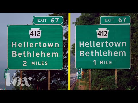
I'm surprised Vox posted a short documentary featurette about the two different traffic sign typefaces in the US at this time, considering Clearview Highway first received interim approval for use on traffic signs in the US around 17 years ago. The interim approval was withdrawn several years ago, but then reinstated when many state DOTs cried foul after spending a hell of a lot of money on Clearview type licenses.
A lot has happened with type since the early 2000's. The OpenType format was newly gaining popularity back then. Clearview Highway is a collection of TrueType fonts. Same goes for so-called "Highway Gothic." Both type families are fairly primitive compared to modern commercial typefaces sold today. Clearview at least has a fairly complete basic character set as well as a complete set of numerator and denominator figures for fractions. Unfortunately the fractions over-shoot cap letter heights, which is a problem.
When professional graphics people buy type these days it's not enough for the font to just look cool or pretty. The type family needs to include a compelling and competitive array of advanced features. The OpenType format allows a great deal of capabilities. The newer OpenType Variable and OpenType SVG formats add even more creative possibilities. It's now common for newly released commercial fonts to have at least several hundred glyphs in each font file, if not more than 1000 glyphs or even over 2000. Contrast that with old TTF files of some version of Highway Gothic. Most of those fonts only contain an uppercase character set and a bare minimum of punctuation. Most freebie fonts offer more than that.
Originally posted by Randy Stankey
I prefer the letters of the Highway Gothic but I like the numbers of Clearview better.
I don't like the curved bottoms of the lower case "L" in Clearview. I like the slanted tops better.
I don't agree with what the guy in the video said about Cleaview being better because the spacing between letters is wider. I think letters should nestle together in consistent ways instead of just being spaced apart.
First, any lines of lettering on a sign panel that will be viewed from a speeding automobile require very loose letter spacing. Tight spacing of lettering only works for close-up viewing, and from a viewing position that is not moving at high speed. Both the old "Highway Gothic" typeface and newer Clearview Highway typeface feature pretty loose tracking for improved distance legibility.
"The guy in the video" is Tobias Frere-Jones. He is just as much an expert on type as anyone currently alive on this planet. He has designed a number of very successful typefaces, with Gotham probably being his best work. For the past 25 years he has taught typeface design at the Yale School of Art.
I've worked with various "cuts" of so-called "Highway Gothic" (there are several variants of FHWA Series Gothic in the market) as well as Clearview Highway. I think FJ's criticisms are spot-on. The original lettering designs first made by Caltrans back in the 1950's were pretty clumsy and crude. That is especially true of the "E Modified" weight. It was originally designed for "button copy" -the little round reflector discs. The act of making the letters thicker to hold those reflective discs led to the consequence of reduced legibility. The holes or "counters" in letters like "e" were tiny. The bends in letters like "s" or "a" were very tight.
In the 1990's many "big green signs" along Interstate highways got rid of button copy lettering. The backgrounds started getting covered with type III retro-reflective green vinyl and computer cut "engineer grade" reflective vinyl lettering. The old Series E/M letter style didn't work so great in that regard. Over-glow or "halation" was a big problem because of the overly bold lettering and other technical issues. That's what inspired the Clearview Highway effort in the 1990's.
Back in the same period, Tobias Frere-Jones improved on the original Highway Gothic designs a great deal with his own Interstate type family, first released with Font Bureau but now available through his own independent foundry. But the Interstate type family was never designed to be used on highway signs. It does not have the appropriate equivalents to the B, C, D, E and E/M widths of Highway Gothic. Interstate has many weights, ranging from Hairline to Ultra Black, but there are only 3 widths (regular, condensed and compressed). And the letter spacing of Interstate is set for normal graphic design use, not traffic sign legends. Clearview Highway has all the corresponding widths to match Highway Gothic plus different "W" and "B" versions for dark and light colored sign panels.
In a couple different "road geek" forums various discussions have gone on over how the tests between FHWA Series Gothic and Clearview Highway were flawed. I think it is very easy to tell Clearview Highway is quite a bit more legible than Series Gothic. Some of the improved legibility does come from points Tobias Frere-Jones described with the letter forms. That is true. However, another big difference is the noticeably larger x-height of Clearview. The lowercase letters are bigger in relation to the capital letters. If you set a line of lettering in comparable weights of both Series Gothic and Clearview, with both lines at the same cap letter height, the line in Clearview will be longer. Meeker and Associates even adjusted for this by making "5W" and "5WR" weights of Clearview for freeway signs. The 5WR weight has tighter letter spacing to more closely match Series Gothic E/M.
I think Clearview Highway looks pretty decent for traffic sign use. It is more refined looking than the old, clunky Series Gothic typeface. It has a much better visual "rhythm" than Series Gothic. Somebody just needs to give Series Gothic a decent visual update and expand the character set from its current, badly primitive condition.
Originally posted by Marcel Birgelen
This Clearview font looks like a discount version of Verdana to me and Verdana is already a discount font in itself.
Clearview Highway looks nothing like Verdana. And I don't know where you get off aiming the "discount version" insult considering a complete Clearview Highway type family license costs nearly $800. But then earlier you casually mentioned Arial was a "clone" of Helvetica. That's so wrong it's not even funny. Arial is no clone of Helvetica. Not even close. Topping it off you didn't even get the history correct (all of which is easily search-able online). Monotype created Arial, not Microsoft. Microsoft only licensed the typeface. Microsoft didn't want to pay Linotype what they wanted to license Helvetica as a system typeface for Windows. Monotype offered up Arial, a typeface in the same "grotesk" type category ballpark, for less money.
Yeah, I knew that he was a big wig in the type and design world. I just didn't remember his name and I didn't want to go back and play the video again just to read his name. Thus, "Guy in the Video."
He is just as much an expert on type as anyone currently alive on this planet.
That, I also understood, although I didn't instantly recognize his name like you. If I did, I might have remembered his name.
I understood he is an expert in his field and that the things he says carry a lot of weight. I was speaking from my own point of view, through the lens of my own condition. My comments were based on that.
I don't see individual characters when I read. I see groups of letters and form them into words. Most people read in groups of letters or make word parts into symbols but that is even more important for me because I get letters mixed up more easily than others do.
I need to see letters in predictable groups so that I can form them into words, easier.
W i t h l e t t e r s t o o f a r a p a r t , i t i s h a r d e r t o r e a d.
Counters and bends of individual letters are less important to me than the way letters fit together with one another.
That's why I like the letters of Highway over Clearview.
For numbers, the opposite is true for me. I need to keep numbers apart so that I don't confuse something like "8675309" with 8673509."
The characters of Clearview, being set farther apart, make Clearview win over Highway in the numbers department.
I don't like the bent bottoms of the lower case "L" in Clearview because I can confuse them with lower case letter "J."
Slanted tops of the strokes do a better job of differentiating "I" from "l" for me.
Clearview Highway looks nothing like Verdana. And I don't know where you get off aiming the "discount version" insult considering a complete Clearview Highway type family license costs nearly $800.
To me it does look like a discount version of Verdana and there is nothing you can do about that. Trump's penthouse in NY also looks tacky and cheap, like the discount version of the Palace of Versailles, while it probably wasn't cheap either.
But then earlier you casually mentioned Arial was a "clone" of Helvetica. That's so wrong it's not even funny. Arial is no clone of Helvetica. Not even close. Topping it off you didn't even get the history correct (all of which is easily search-able online). Monotype created Arial, not Microsoft. Microsoft only licensed the typeface. Microsoft didn't want to pay Linotype what they wanted to license Helvetica as a system typeface for Windows. Monotype offered up Arial, a typeface in the same "grotesk" type category ballpark, for less money.
Funny, I didn't mention anything particular about the history of Arial, I never mentioned that Microsoft created it. And... I also didn't call it a clone, but a "discount version of", which it essentially is... While the type-face is technically not a clone, most of the rest of the font is: The font metrics are supposed to be compatible with Helvetica, so any document formatted with Helvetica could easily be switched to Arial, without a need to change the layout. Arial was marketed as the cheaper alternative to Helvetica.
Microsoft has since paid for all extensions to the font and although it can still be licensed through MonoType, Microsoft seems to have sub-licensing rights themselves.
Bobby, is there any reason why you think you need to piss on me? For this one, you'd to go several pages back, just to find something to nitpick on. Well, bravo for putting in the work.
If this is the way you want to continue discussions, be my guest, I'm not entirely made from sugar. But, I can't judge about others, maybe they're pulling out their popcorn every time such a post appears... But maybe, just for the sake of it, or at least for the sake of your own blood pressure, can you just tone down the personal attacks a bit?
Originally posted by Randy Stankey
I prefer the letters of the Highway Gothic but I like the numbers of Clearview better.
I think I agree on that.
Originally posted by Randy Stankey
I don't like the curved bottoms of the lower case "L" in Clearview. I like the slanted tops better.
I also agree on that, but I do understand the curved bottoms, which seem to be the more contemporary way of distinguishing between a capital I and lowercase L.
Originally posted by Randy Stankey
I don't agree with what the guy in the video said about Cleaview being better because the spacing between letters is wider. I think letters should nestle together in consistent ways instead of just being spaced apart.
Personally, I think that consistency between signs is even more important. I'd say that using multiple typefaces between signs can be highly confusing. Several experiments have shown that you don't recognize letters individually, but that words are saved more like an image than a string of letters in your brain, like you indicated yourself.
Originally posted by Randy Stankey
My main problem isn't with reading or numbers, per se. The problem is that things seem to jump around on me, every time I look.
Have you ever experienced the phenomenon when you are writing something then you lay your pencil down then can't find it a moment later? You could have sworn that you put it down to your left but, after searching, you find it on the right? It feels like the pencil jumped across the table when you weren't looking! I have fought this problem on a nearly continuous basis, every day of my life, as long as I can remember. I have developed some pretty novel strategies for dealing with this problem without even realizing what I was doing. For instance, I developed the habit of always putting my pencil down in the same place... In the pencil cup, for instance.
My "problem" seems to be contained to numbers, at least as far as I know. It may also affect me otherwise, but I honestly couldn't tell. I've heard about others who simply remember stuff wrong, like where they put their pencil. That doesn't really happen to me. Actually, I tend to almost freak out when stuff isn't where I left it and someone else "misplaced" it. In general, I tend to remember stuff well, but give me any sequence of numbers, and I'll still remember the numbers themselves, but I'll completely forget the sequence. This also happens to stuff like PIN numbers, which can be an embarrassing experience when you're trying to pay for something using a debit or credit card. But it also happens with stuff like hotel rooms, parking spaces and it's the reason why you should never ask me to do some basic calculation in my head.
Originally posted by Randy Stankey
I have been going through life, for fifty-plus years, thinking that I'm just a clumsy, forgetful, stupid and lazy person when, all this time, something else was going on that I didn't even understand.
It pisses me off!
Well, at least you could put something like a label on it. There are many people out there, who do have all kinds of problems, but which will never be correctly diagnosed. I think it's always good to know about your own limitations, because that way, you can try to improve on them and if that's just not possible, at least work around them. Those workarounds help me to not end up in a busy line at the cashier, with a blocked credit card. :P
Those workarounds are the reason I got clued in to the problem, in the first place.
I have a number of habits and behaviors that, as I happened to read something on the subject of dyslexia, started making proverbial bells ring in my head. If you get one or two "hits" on a list of ten traits, call it coincidence. If you get nine out of ten hits, you've got something to think about.
Even though my desk might be messy, I have things arranged in a "certain way" and when somebody comes along and straightens my desk, I get upset. Yes, that's a meme. It was even a line in the song "Blinded Me With Science." "She's tidied up, again, and now I can't find anything!" But, it's a trait.
Being seen as an "overachiever," yet people think of you as "not working up to potential" is another trait.
Rule-Mindedness, acting like there is a rule for everything and that all rules have to be obeyed at all times.
Having a strong sense of ethics and getting bent out of shape when your expectations aren't met.
One of the biggies for me is... Understanding concepts in higher math but can't show it on paper.
I remember sitting in my first algebra class, listening to the teacher explain things, and I understood the lecture, almost intuitively. Then, when it came for test time, I failed badly. I remember my first semester grade in algebra was 3%! That's "ZERO-THREE!"
When my father saw my report card, I practically got the beat shit out of me!
One, two or even a half-dozen "hits" on a list of traits does not necessarily mean you have a problem but I've got a four page document that contains fifty or sixty questions and, by my memory, I think I got hits on forty out of fifty of them.
I'm not ready to stand up and shout that I've got dyslexia, just yet, but I've sure spent a lot of sleepless nights, thinking about it!
For me, it was, maybe a little bit the other way around. Only when I started to accept my limitations, I started to implement workarounds. Before, I tried to remember sequences of numbers for hours on end, trying to solve simple math in my head, only to constantly keep failing at it. Before we were used to allow a calculator, I mostly horrendously sucked at math in school, while everybody thought I was just lazy. But, eventually ended up studying something that was... mostly math.
We've built our society around endless competition, where the rule seems to be to outperform the other, whatever the costs are. While this is already taking a lot of toll on all the "normal functioning" people, it's an increasing problem for all those who don't function like the established norm. While we're getting better at identifying those kind of "problems", our society isn't built to support those kind of people and as such, many end up being marginalized, while many of those people can be highly skilled at certain tasks.
My wife has been diagnosed with Asperger Syndrome. Though this is generally a higher functioning form of autism, it's not like you aren't confronted with the "complications" on a regular basis. I've found some of the same traits she suffers from in myself, but we humans constantly try to fit anything we perceive into certain categories. So, even though I share some common traits with her, I'd not consider myself anywhere near to being an Asperger myself. The same is with my "problems with numbers", I never considered to be sufficient severe to call it "dyslexia".
I’m the opposite. I don’t accept limitations. They are goals to be conquered.
Do you know the TV show, “NCIS” where Gibbs used to slap DiNoso upside the head?
My father was like that only it wasn’t done to be funny.
At work we have to use the Military color code. Brown, Black, Red... etc...
It uses three colors to represent numbers up to 100.
When I had to build a 100 position wire harness that used the mil-spec code it took me twice as long to build one unit as everybody else and I still had a lot of mis-wires. I made the mistake of telling the supervisor about my problem and he tried to take me off the job.
I sore at him, told him “No!” and said, “I WILL conquer this!”
I did.
The thing that pisses me off the most is when people find out you have dyslexia they treat you like a dumbass. No! I’m smarter than nine out of ten average people and I have papers to prove it.
Dyslexia is NOT a disability! It is simply a fundamentally different way of perceiving the world.
It pisses me off to no end when people treat dyslexics like they are retarded.
That’s why I said, to the supervisor, “Stop treating me like a fucking dumbass!”
 Tweet
Tweet


Comment